A business dashboard shows key indicators and business operations in real time. This visual interface helps managers make smart decisions and monitor their company's performance.
Studies show that companies using business dashboards are 20% more likely to hit their goals. It's a significant advantage over those who don't use them.
Setting up a business dashboard is key to better company performance. This guide will help you craft a dashboard that offers insights and makes smart choices.

Key Takeaways:
- A business dashboard is a visual interface that displays key indicators and business operations in real time.
- Organizations that use business dashboards are 20% more likely to achieve their business goals.
- To create an effective business dashboard, follow the steps outlined in this guide.
What is a Business Dashboard?
A business dashboard shows key indicators and operations in a graphical format. It gives real-time data that's easy to understand. This helps managers make quick, smart choices and improve the company.
These dashboards allow you to track how well your business is doing. This includes how happy customers are, how smoothly the business runs, and how much is sold. Leaders get the big picture in a glance. Then, they can make decisions based on the most recent data.
If you're in charge at work, a good business dashboard can really help you. It makes it easier to work with others and helps everyone aim for better results. A dashboard shows what's important in a clear, interactive way, supporting you in spotting chances and solving issues. This means you can make your business work better and smarter.
Why is Having a Business Dashboard Important?
A business dashboard serves as a centralized hub for critical data and metrics, offering a concise yet comprehensive snapshot of a company's performance. It provides real-time insights into key areas such as business continuity, sales, operations, marketing and finances. This enables informed decision-making at all organizational levels.
Dashboards consolidate complex information into easily digestible visuals to empower leaders to quickly identify trends, spot opportunities, and address challenges proactively. This results in improved efficiency, productivity, and strategic growth initiatives.
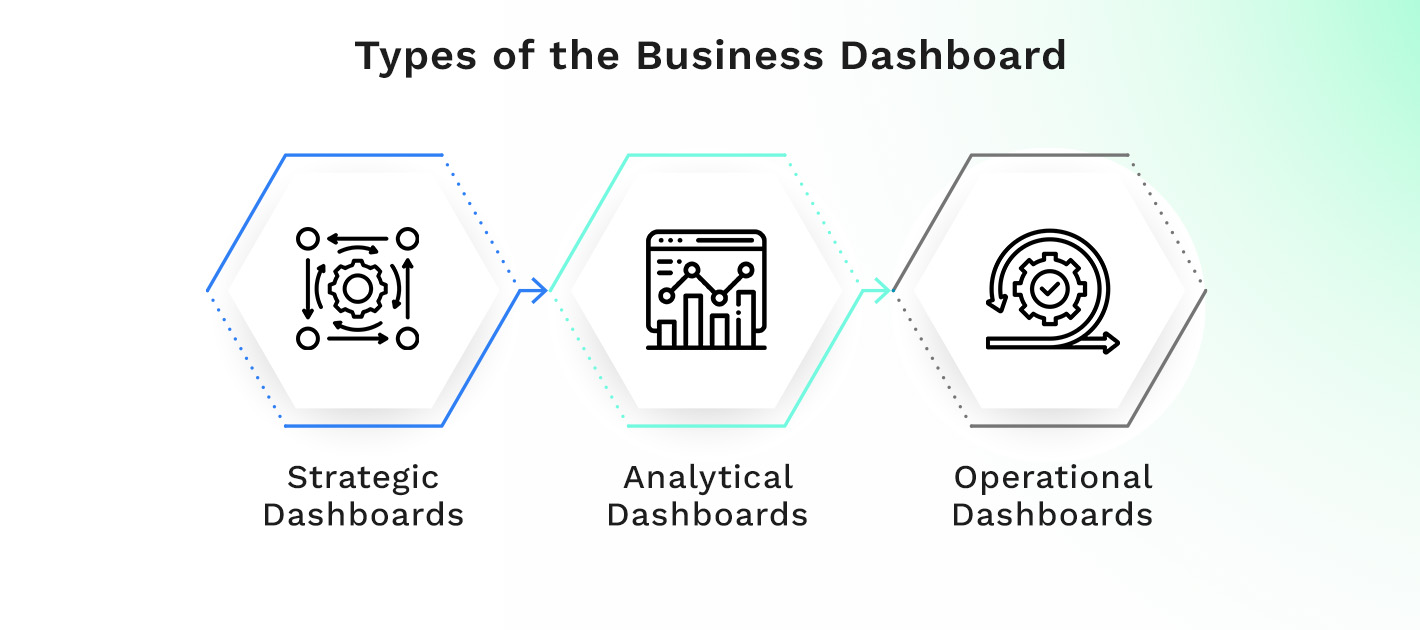
Types of the Business Dashboard
Business dashboards come in three main types: strategic, analytical, and operational dashboards. Each type meets different needs in a company.
Strategic Dashboards
Strategic dashboards examine past actions and set future goals. They highlight important metrics for top-level decision-makers and help leaders monitor progress and make smart choices to reach long-term goals.
Analytical Dashboards
Analytical dashboards analyze data to understand causes. They let users pull data apart, spot trends, and find new insights. With cool visual features, analytical dashboards help users explore data in new ways.
Operational Dashboards
Operational dashboards are all about current data and fixing problems fast. They show up-to-the-minute operations, helping teams stay on track. These dashboards are key for making sure everything runs smoothly.
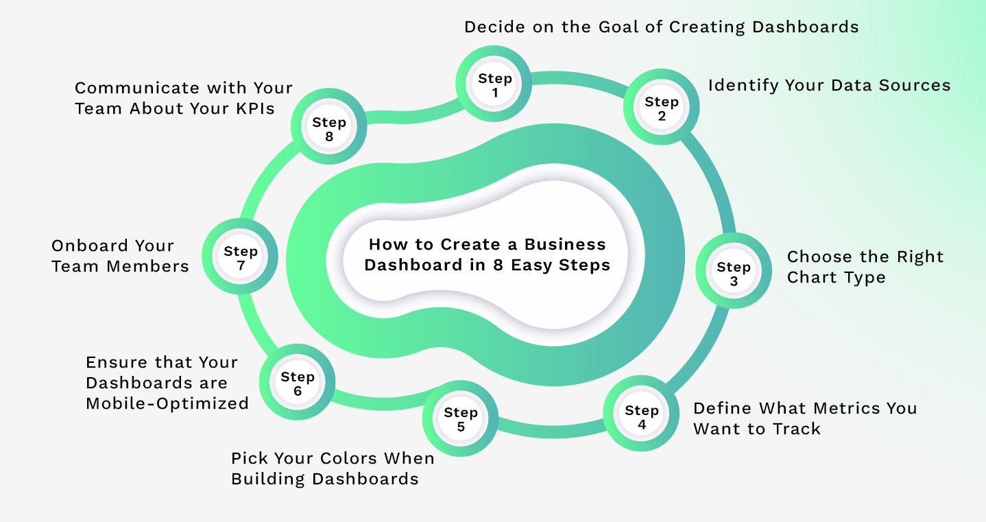
How to Create a Business Dashboard in 8 Easy Steps
Here are the steps to create your business dashboard.
Step 1: Decide on the Goal of Creating Dashboards
Making a business dashboard means first knowing what you want it to do. Think about the people using it and what you hope they will achieve.
Think about what specific data or info you need from the dashboard. This might be about your sales, how smoothly your operations run, how happy your customers are, or other important areas for your business.
Decide if the dashboard is for top management, department heads, or staff. Knowing your audience helps customize the dashboard to their needs.
Figure out the specific actions or calls that should result from using the dashboard. This insight is crucial for designing a clear and useful dashboard, showing relevant data that’s easy to act on.
Once you've answered these questions and set your goal, you're on track to design a helpful dashboard. The aim is to use data visually to support smart decisions and achieve better results.
"The goal of creating dashboards is to provide a visual representation of data that empowers your team to make informed decisions and drive positive outcomes."
| Benefits of defining the goal of creating dashboards | Example |
| Clear focus | Improve customer satisfaction by analyzing feedback and response times. |
| Relevant data inclusion | Include sales projections and revenue targets for the sales team dashboard. |
| Alignment with objectives | Track employee productivity metrics to ensure alignment with company goals. |
Step 2: Identify Your Data Sources
After setting your business dashboard's goal, look for the data sources you need. There are two main types: internal and external data sources.
Internal data sources are within your company. Think about sales, marketing, finance, ops, and HR. They include databases, CRM, ERP, spreadsheets, and files.
External data sources come from outside. These details add more to your internal data. They might be from industry reports, market data, surveys, or social media, like Google Analytics.
Make sure the data fits your goals and is good. Always consider data quality, availability, and biases. Keep a detailed list of all your data sources. This list is your data roadmap that tells you what you use in your dashboard, keeping things organized.
Consider using a tool that automates collecting data. Updating your dashboard with fresh information will make your job easier without you having to do much.
"The quality of your dashboard is directly tied to the quality of the data you collect."
Take a look at this table. It shows different sources for a sales dashboard:
| Data Source | Description |
| Sales CRM | A central repository of all sales-related data, including customer information, leads, and opportunities |
| Website Analytics | Data collected from your website, including traffic sources, page views, conversions, and other engagement metrics |
| Email Marketing Software | Data related to email marketing campaigns, such as open rates, click-through rates, and email performance metrics |
| Customer Surveys | Feedback collected from customer surveys or satisfaction ratings, provides insights into customer experience and sentiment |
| Social Media Analytics | Social media data includes follower counts, engagement metrics, and sentiment analysis |
Step 3: Choose the Right Chart Type
The chart type you choose decides how the information is shown and greatly affects how well viewers understand what they’re seeing. Think about what data and key points you need to share. Then, pick a chart that fits those needs well.
Here are some chart types good for business dashboards:
- Line charts: Perfect for showing trends and continuous data over time.
- Bar charts: Best when comparing different groups or categories.
- Pie charts: Great for showing parts of a whole or percentages.
- Sparklines: Mini line charts that fit into smaller spaces to show trends.
- Scatterplots: Shows how two things relate to each other on a graph.
- Gauge charts: Ideal for tracking progress on goals or performance metrics.
Bubble charts, however, can be too busy and might not work well for business dashboards. They can make things harder to understand.
A dashboard tool with many chart options is lets you easily pick the right chart type for your specific data needs. The right chart type makes your data clear and easy to understand. Make sure it highlights the relationships and patterns in your information well. This way, you and your team can use the dashboard to make smart decisions.
Step 4: Define What Metrics You Want to Track
After picking the right charts and data sources, choose what you'll measure. These are called key metrics or key performance indicators (KPIs). They show how well your business is doing. Make sure the metrics you choose match your goals so that you can keep an eye on the important things.
Metrics to track:
- Customer Satisfaction: Find out how happy your customers are with surveys or feedback. A Net Promoter Score (NPS) can also help.
- Operational Efficiency: Look at productivity, resource use, and process improvements. This shows where you can get better.
- Financial Health: Monitor your finances. Check revenue, profit margins, cash flow, and ROI to assess your business's performance.
- Marketing Effectiveness: Review your marketing’s impact. Use conversion rate, CPA, and ROAS to see if it's working.
- Sales Performance: Focus on sales numbers. Check revenue, customer growth, and deal sizes to see how well your sales team performs.
Monitoring these KPIs will give you a good view of your business's health. They will uncover trends and help you use facts to steer your business. These key metrics are the basis for checking if your strategies are working and finding ways to do better.
Step 5: Pick Your Colors When Building Dashboards
The colors you pick affect how your dashboard looks and feels. So how do you choose the best ones? Choose a color combination that is visually appealing and easy to understand. Pick pleasing colors that go well together. This makes info easy to grasp. Also, think about your brand's colors and avoid excessive use of bright or highly saturated colors. Loud colors can be too much and hard to look at. Use calm and gentle colors. They make viewing more comfortable and enjoyable.
"Colors can significantly influence the user's perception of the information presented on the dashboard. Consistency in color choice promotes ease of understanding and improves user experience."
Limit your palette to 2-3 colors for a neat, unified design. This approach avoids a messy or confusing look. It also helps users connect colors with specific meanings.
Always aim for clarity and understanding in dashboard design. The right color choices can improve how people read and interact with your dashboard, increasing the dashboard's effectiveness.
| Color Combination | Description |
| Monochromatic | Consists of different shades of a single color. Provides a clean and minimalist look |
| Analogous | Uses colors that are adjacent to each other on the color wheel. Creates a visually harmonious palette |
| Complementary | Pairs colors that are opposite each other on the color wheel. Adds vibrancy and contrast to the dashboard |
Step 6: Ensure that Your Dashboards are Mobile-Optimized
Your business's dashboards must work well on phones and tablets. This way, your team can use them easily wherever they are.
Think about the different sizes of screens on mobile devices when creating your dashboard. Make sure the layout and text are clear. Use a design that responds to any screen size. This makes the dashboard look good and work well on all devices.
Mobile-optimized dashboards allow users to access critical business information and insights from their smartphones or tablets, providing flexibility in accessing and analyzing data. With mobile-optimized dashboards, users can monitor key metrics in real-time and make informed decisions on the go, ensuring agility and responsiveness.
They also facilitate seamless collaboration among team members, as they can easily share and discuss data insights, regardless of their location. Team members can access optimized dashboards on their mobile devices to efficiently manage tasks, track performance, and drive productivity, even when away from their desks.
Step 7: Onboard Your Team Members
After creating your business dashboard, it's time to ensure everyone knows how to use it well, which means offering training and support. Think about your team's needs and how they will use the dashboard. Customize it to make it work for them, ensuring a smooth experience.
Your dashboard should be simple to use, look good, and be easy to get around. With good training, your team can use the dashboard effectively.
Always let your team share how they feel and ask any questions they have. This will ensure that your team gets more out of the dashboard.
Step 8: Communicate with Your Team About Your KPIs
For your business dashboard to work well, everyone must communicate clearly. Make sure your team gets why you track certain goals on the dashboard.
"Communication is key to success. Regularly share insights and trends the dashboard reveals with your team members to foster a data-driven culture within your organization."
Talk about why the KPIs are important to your team's objectives. Open discussions help team members share their thoughts. They can also give valuable feedback using the dashboard's findings. A work environment where everyone can discuss KPIs is great for solving problems. It also helps your team get better and better at what they do.
| KPI Communication Checklist | Action |
| Keep team members informed of dashboard updates | Schedule regular team meetings and updates |
| Encourage team members to share their insights and interpretations | Facilitate open discussions and provide a safe space for sharing |
| Recognize and highlight individual and team achievements | Celebrate milestones and successes |
| Solicit feedback on the usefulness and effectiveness of the dashboard | Conduct surveys or one-on-one feedback
sessions |
Create Your Business Dashboard with Kohezion
With Kohezion, you can easily create a customized business dashboard tailored to your specific needs. This powerful tool allows you to design a dashboard that provides real-time insights into key metrics and performance indicators relevant to your business.
Using Kohezion to build your dashboard can help streamline data visualization, improve decision-making, and increase business efficiency. With the ability to customize your dashboard to track the metrics that matter most to your organization, you can gain a comprehensive overview of your business operations and identify areas for improvement.
Conclusion
Making a business dashboard is key to tracking your company's performance. This guide will help you create a powerful dashboard that gives you important information and helps you make smart choices. With a great dashboard, you can turn your business's data into real, useful insights. It will help you learn important things about your business and lead you to success.
Ready to create your own business dashboard? Contact Kohezion to start!
Start building with a free account
Frequently Asked Questions
The frequency of updates depends on your business needs and the nature of the data being displayed. Generally, it's recommended to update the dashboard regularly to ensure data accuracy and relevance.
You can ensure data security and privacy by implementing robust access controls, encrypting sensitive data, and adhering to data protection regulations such as GDPR or HIPAA, depending on your industry.
You can measure effectiveness by tracking key metrics such as user engagement, data accuracy, decision-making efficiency, and business performance improvements attributed to the dashboard.
Yes, common pitfalls include overloading the dashboard with irrelevant data, neglecting user feedback, failing to update data regularly, and overlooking accessibility considerations for all users.